


You have probably heard about responsive design before. CSS that changes based on the device's screen size. Media queries are what makes responsive designs work.
How do they work?
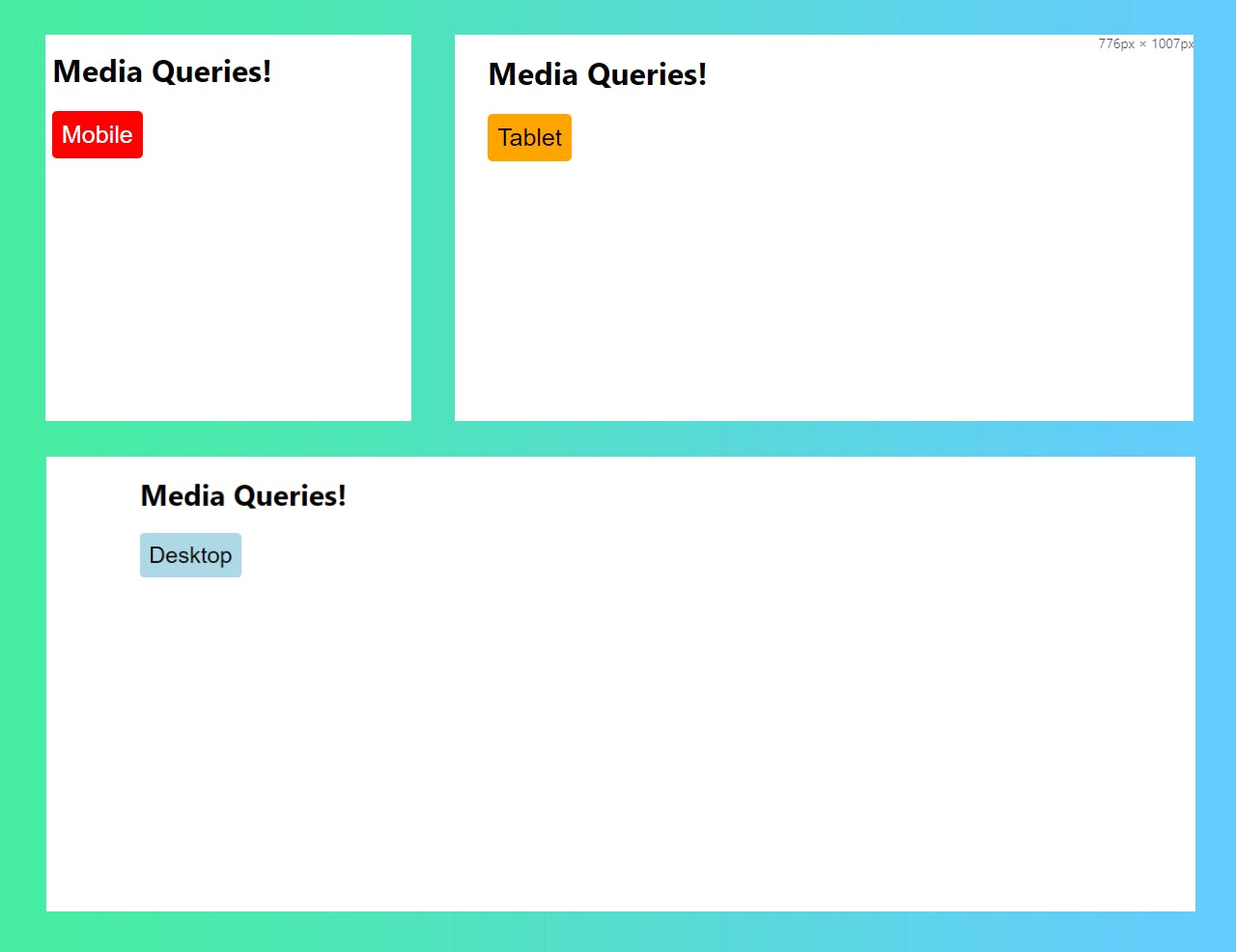
Media queries simply change the CSS properties applied based on the screens size. They can be confusing and overwhelming, so let's keep it simple!
/* Base Class - Phones will always have a red button  */
/* Less than 767px */
/* .button will have red background and black text */
.button {
    background-color: red;
    color: white;
}

/* Laptop & Tablet */
/* CSS is used for screens 767px - 1280px */
/* .button will have white background and black text */
@media (min-width: 767px ) {
    .button {
        background-color: orange;
        color: black;
    }
}

/* Desktop */
/* CSS is used for screens 1280px and up */
/* .button will have blue background and black text */
@media (min-width: 1280px) {
    .button {
      background-color: lightblue;
    }
}
There are a couple of things to unpack here...
- Our base CSS for
.buttonis applied to all screens. Any CSS for.buttoninside of media queries will add to.buttonstylings. - If a property is both in the base
.buttonclass and a media query.buttonclass, that media query will take precedence. - This style of media queries using
min-widthis called mobile first design. This means your base.buttonclass is what will be used for screens under 640px (phones). The media queries only take effect as the screen size grows. - CSS is read top-down. This means if we have multiple rules for
.button(which we do), the stylings that come later in the file take precedence. Because of this, it is important for our larger media queries to be in ascending order by size, with our base classes first. - This CSS is accounting for 3 device sizes. You can account for more devices if you would like but we are trying to keep things simple!