


Bootstrap has held a lot of fullstack devs hands when it comes to creating sites. A lot of us don’t know how to use Figma, are unsure of what good “design” is, and are not proficient with CSS properties.
But damn are we good at whipping up a database schema, building our controllers and models, slapping a bootstrap theme we found on Google on our views, and calling it a day.
The end result usually leaves a person satisfied with the efficiency they created their site but unsatisfied with the result.
“It looks ok but not like that awesome site from some amazing designer I saw recently” -- generic fullstack dev.
This article is a tutorial of actionable design tips to achieve satisfaction with the look of your bootstrap themed site.
Setup
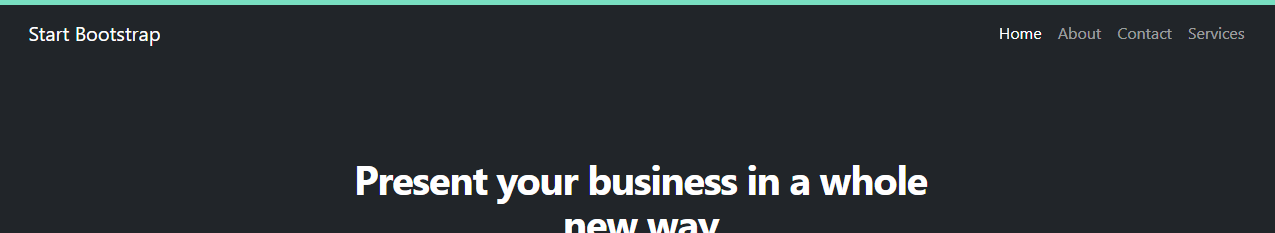
I’m going to be starting with this free bootstrap theme. Now lets improve it!
Expand your colors
Update your color palette
Bootstrap comes with a whole color pallet you might not have known about. Take advantage of it to look different than the other cookie cutter bootstrap sites.
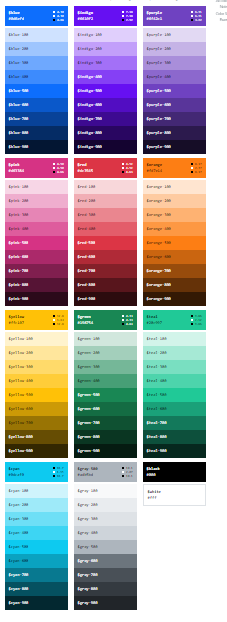
To get access to these color, we just need to add them to our scss/_variables.scss bootstrap file.
$theme-colors: (
  "primary":    $teal-300,
  "secondary":  $secondary,
  "success":    $success,
  "info":       $info,
  "warning":    $warning,
  "danger":     $danger,
  "light":      $light,
  "dark":       $dark
) !default;
Or if your using an npm setup for Bootstrap, update your custom sass file that gets compiled.
@import "../node_modules/bootstrap/scss/functions";
@import "../node_modules/bootstrap/scss/variables";
$custom-colors: (
    primary: $teal-300,
);
$theme-colors: map-merge($theme-colors, $custom-colors);
@import "../node_modules/bootstrap/scss/bootstrap";
Now we can update that gross bootstrap primary blue to a nice soft teal for our get started button. We’ll also want to change the text from white to black by removing the text-white class on it. This is for readability on the lighter background color.

Add a color hint to the top of your hero section
We can add a small border to the top of the nav to bring some extra life to our page with the new teal primary color via border-primary.
Text
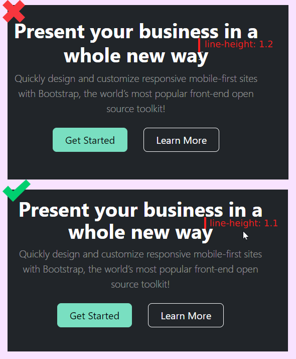
Change line heights for common elements
A subtle change a lot of people don’t know about is reducing your line heights the larger the text is. Let's override the default line heights for common html elements in our css file.
h1 {
    line-height: 1.1;
}

h2 {
    line-height: 1.125;
}

h3 {
    line-height: 1.25;
}

p {
    line-height: 1.5;
}
Update Letter Spacing
Large headlines generally have to much letter spacing by default. Condense the letter spacing of your h1 and h2 tags by updating our css file like we did for line height.
h1 {
    line-height: 1.1;
    letter-spacing: -0.05em;
}

h2 {
    line-height: 1.125;
    letter-spacing: -0.025em;
}

Heavier headline supporting text
Now we can beef up the supporting text in the hero. The contrast between it and the H1 tag is to extreme. We'll remove the lead class and give it a fs-5 class. This comes with a thicker font-weight.

Summary
Where were at so far...
 I wanted to do this theme refactor in 1 blog post but it's just to much content. So i'm splitting it up into several articles.
Check back next week for article 2 or subscribe to my Newsletter at thefullstackdev.net. I'll be updating the feature section of the theme and will have some 🔥 tips for you.
I also highly recommend checking out Refactoring UI. It completely changed my perspective on design as a dev.
✌️